Abstract Nature : Personal Project 1

Abstract Nature : What is abstraction
Abstract photography, sometimes called non-objective photography, is a means of depicting a visual image that does not have an immediate association with the object world and that has been created through the use of photographic equipment, processes or materials. Abstract photography focuses on the elements of art and the principles of art. These are known as the formal elements of photography. Below are some examples of abstract photography that I am inspired by and some initial research of the formal elements.


Abstract Nature: INVESTIGATION OF ABSTRACT PHOTOGRAPHY TECHNIQUES/ Monochromatic Photography, ICM and Shallow depth of field.


Monochromatic Shoot


|
I used the monochromatic technique because unlike in colour where the photo can be made up of several colours, you only rely on a few tones when shooting in monochrome. It keeps the viewer's eyes on your image instead of wandering off. For my shoot I used a canon 4000D with a standard kit lens. I used the monochromatic mode and my shutter speed was 1/2000. The weather was quite windy but had nice natural lighting. The wind affected my shoot at times because when i would want the leaf to stay still it kept blowing and moving. A benefit of shooting in black and white was that if some of the leaves where an odd colour, it wouldn't matter all that much because it would be in black and white. A limitation I had with shooting outside was that the wind kept blowing the leaves around and was hard to get a nice steady photo.
|


|
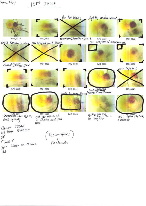
ICM Shoot:
contact sheet:


|
ICM is when you intentionally move your camera when taking your photo to get a blur effect. People use this method as a form of abstract photography because it doesn't give you the full clear image or tell you exactly what the image is so you have to guess what the image could be. For this shoot I used a canon 4000D with a standard kit lens. My shutter speed was 1 or 2 seconds. I took these pictures inside with a mix of natural lighting and the regular lights on the roof. A benefit to shooting indoors is that there was no bad weather which could affect the photos.
|


|
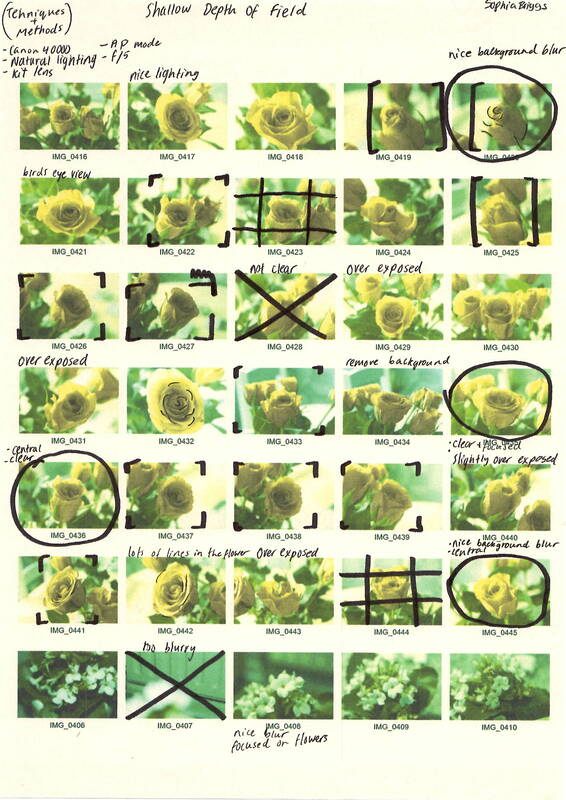
Shallow Depth of Field:
contact sheet:


|
Shallow depth of field is when part of the image like the background is blurred so you are only focused on the main part on the image that isn't blurred. Shallow depth of field works in portrait, nature, and travel photography. The out of focus part may be only slightly blurred or be completely lacking detail. For this shoot I used a canon 4000D and a standard kit lens. The shutter speed was 1/2000. An advantage of taking these photos outside is the natural lighting because sometimes indoor regular lights can give off glare or make the photos look strange.
|

|


Best Images
|
I feel this image is successful because of the use of elements of line and pattern and how the leaf dynamically moves across the image. I think there is a great use of shallow depth of field and it brings focus to the leaf and makes it look more abstract. The lighting in this image also brings clarity to the photo. Using Pixlr, I post edited the image's exposure, tint, levels and curves. This has added a lot more tones to the image. I feel this image has a clear focal point and to help it fit into the rule of thirds I slightly cropped it to make it look more central. After editing I am very pleased with this image.
|

|
I feel this image is successful because of the way the formal element of line and shape dynamically move across the image to form abstraction in the photo. I like the lighting in this image and how it highlights the top of the leaves. I think the rule of thirds is also involved in this image because although there are many lines there is one particular leaf that is central to the image. Using Pixlr, I post edited the image's tints, levels, exposure and curves. This created extra tones and highlights and made the photo brighter unlike the original photo which was quite dull. Overall, I am very pleased with this image.
|

|
I feel this image is successful because of the use of the formal elements line and shape. The use of shallow depth of field brings clarity and focus to the leaf in the middle. I used the rule of thirds to focus on the central leaf. I also did some cropping to make sure that leaf was the main focal point. I used Pixlr to post edit the image's tints, levels, exposure and curves. This created contrast between the lighter and darker colours and added some highlights to some parts of the leaf, as well as adding more tones to the image. After editing, I am very happy with this image.
|

|
I feel this image is successful because of the way formal elements of line, shape and pattern dynamically move across the image. I think the shallow depth of field focuses the image nicely and brings clarity to main leaf. I did some cropping so that the leaf fit nicely on the picture. I also like how the leaf curves across the image. I really like the way the lighting hit the leaf to make a nice natural highlight. I used Pixlr to post edit my picture's tints, exposure, curves and levels. This added extra tones and more contrast between the darker and lighter ones. After editing, I really like this image.
|
Artist Investigation / Edward Weston
“The camera sees more than the eye, so why not make use of it?” – Edward Weston 
|
To begin my abstract nature artist investigation. I will initially study the work of Edward Weston because I like the abstract photography and sharp images which were shot in lowkey lighting. I really like his close-ups of seashells, halved cabbages and peppers.
Edward Weston was born march 24, 1886 in America. He started taking photos when he was sixteen. He originally shot in soft focus and high key portraits however he later changed his photographic style and began to be fascinated by abstract photography with sharp images and lowkey lighting. He took his photos using a view camera and processed his film using a dark room. I chose this inspirational quote because I feel it shows Weston's understanding of abstract photography and how he sees the world around him. I think this quote shows a good understanding of abstract nature because you can't always see every detail of things or get a real understanding of how it looks so photography is a great way to capture it. This video is inspirational to me because it signifies the range of genre that Weston was working with and shows a lot of his abstract images and still life. |


SEMI Analysis / Edward Weston

Technical Processes / Low Key |
Subject: The Photographer of this image is called Edward Weston and the title of this photograph is Pepper No. 30 and it was created in 1930. The genre of this photograph is still life but you could also class it as abstract. The props I can see in this picture is one green pepper that is very deformed but has lots of texture and line. Element: The composition of the photo shows a pepper that is in middle ground of the picture. I think the rule of thirds has been used in this image. The viewer’s eye is lead around the photo because of the composition & perspective Edward Weston has used. The perspective that Edward Weston has taken the photo from is at eye level. This perspective is effective because you can get a clear view of the object in the photo and in this case you can see some parts of the side of the pepper. The Photographer uses a range of visual elements in his work. The most striking elements are line, form, tone and texture. Media: The photo has been taken from a short distance so you can only see the pepper and not any distractions in the background. The pepper has been placed in the middle ground. This draws the viewers attention to the main focal point of the pepper. The photo has been taken with natural light coming through the window and a large white reflector. The light source is placed on the top left which is creating highlights on some parts of the pepper. It is also creating some shadows in other places where there is less light. This creates an atmosphere because the light creates grey tones and contrast on the pepper which makes the image look darker in some places but bright in others. To emulate this photograph myself, I would use the monochromatic setting on my camera and use natural lighting. Intent: I feel the photo conveys a message of darkness and almost a sad mood. It does this by using very dark, gloomy tones and the shape of the pepper kind of looks like a person sat on a floor with its head down which creates a dark atmosphere. The shadows on the image also help covey the mood. |


|
Lowkey photography requires a dark background. Depending on what kind of light source there is, it is best to use a fast shutter speed. Because not a lot will be in the image it is important where the lighting hits the object so it doesn't ruin the lowkey part of the shoot. It is best to put your light source at the side of the object instead of the front because it will make more contrast and tone on the object.
This shoot was inspired by Edward Weston because I really like his style of work and his abstract photography. I will do this shoot indoors during the morning because there will be not too much bright light coming through the windows but a nice amount. The props used will be a plant pot, a piece of black card, and a vegetable. I need the plant pot to put the vegetable in and the black card to remove any of the other background showing because we need the background dark for the lowkey effect. The lighting conditions I will require are dark lighting because with lowkey photography you need a dark background. I will use natural lighting from a window and it will be hitting my object from the side to create contrast and tone on my object. I intend to shoot with a canon 4000D with a standard kit lens. To avoid shake and movement in the photo I will stabilise it using books. I intend to use a small aperture f/22 for a large depth of field. I intent to use a fast shutter speed because it lets less light in so the image wont be too bright or over exposed.
|
Shoot plan:


|
The strengths in this image are that it includes lots of texture and lines, it is also centred in the page which makes it look nice. When post-processing I used PIXLR to adjust the highlights and shadows to draw attention to smaller details, I then adjusted the brightness and contrast to increase shadows and show the bolder tones. Finally I adjusted the temperature and tint to add more of a blueish effect which I think makes the image look more interesting. For lighting I used natural light from a window.
|

|
The strengths in this image are that it includes lots of line and textures, I also like that they are both right in the middle instead of off to the side. When post-processing I used PIXLR to adjust the brightness and contrast to create more tones. I then adjusted the highlights and shadows to make the image look a bit brighter. For lighting i used an artificial box light with a black screen behind it.
|

|
The strengths in this image are that there are many tones and textures. I really like the way the lines look and move on the object. When post-processing I used PIXLR to adjust the temperature and tint to create a blueish effect to make the image look more interesting. I then adjusted the highlights to make some of the smaller details more noticeable. Finally, I cropped it to make it look more central. For lighting I used an artificial light box with a black screen behind it.
|

|
The strengths in this image are that there are many tones and textures and I like how the image isn't totally central but slightly off to the side. When post-processing I used PIXLR to adjust the highlights and shadows to make the image look less dull. I then adjusted the temperature and tints to brighten up the image. For lighting I used an artificial light box with a black screen behind it.
|
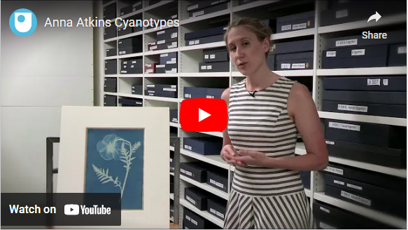
Abstraction through cyanotypes / Anna Atkins
|
Anna Atkins was an English botanist and photographer. She was mainly known for her cyanotypes. Cyanotypes are printed pictures that when you use put ferric salts on paper and put leaves or other objects on them and put them under a UV light, you get a image of the object in white whilst the rest of the paper is blue. Advantages of cyanotypes are that it is easy to do and don't need a lot of things to do it. Disadvantages of cyanotypes are that they could come out really pale and this could make your image look dull and you wont be able to make the image out properly. Modern cyanotype artists still use this method today because it is an easy method to use and it makes a very nice image once its done.
|


Abstraction through photograms / Man Ray

|
Man Ray was an American visual artist who mainly worked with photograms. He spent most of his career in Paris. A photogram is a photographic image made without a camera by placing objects directly onto the surface of a light-sensitive material such as photographic paper and then exposing it to light. An advantage of photograms is that they are easy to make and don't need a lot of equipment. A disadvantage of photograms are that because the images are so abstract you might not be able to tell what it is.
|


Horst P. Horst / The unfamiliar and abstracted.

|
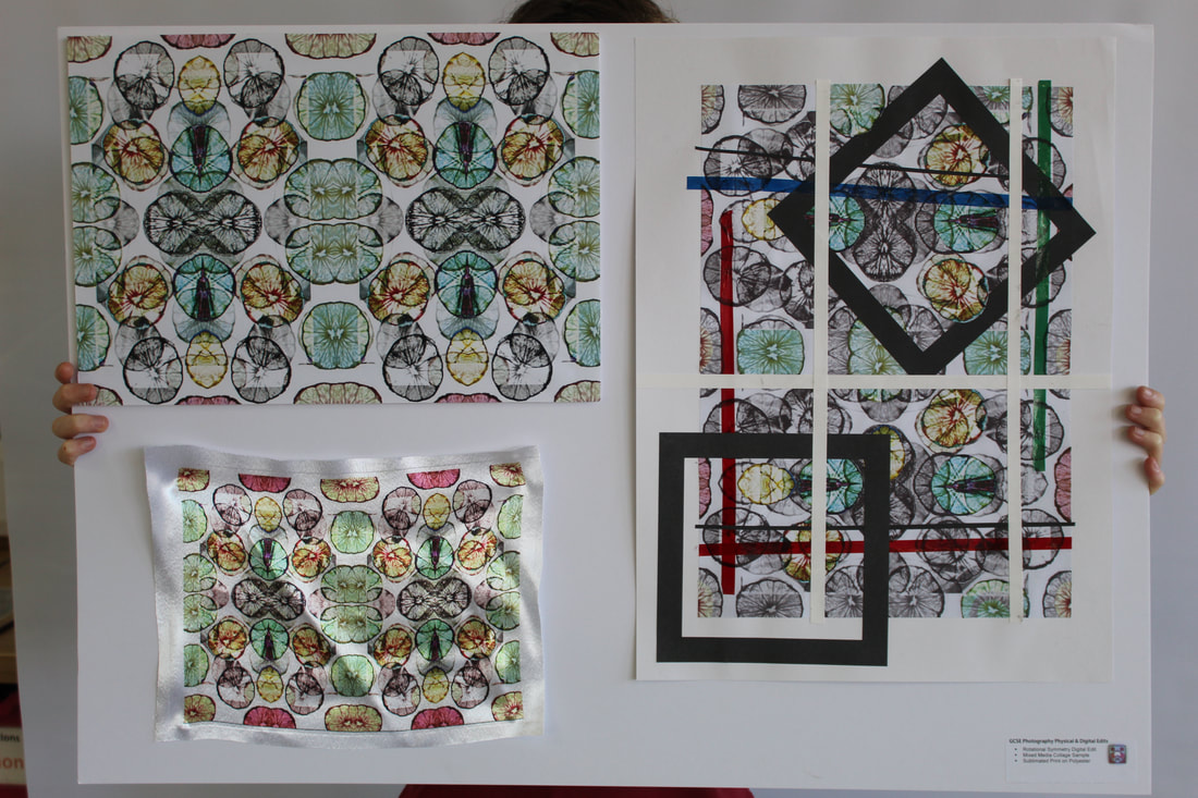
Fashion photographer Horst P. Horst used rotational symmetry to create new patterns. His book, Patterns from Nature (1946), has inspired me to create my own series of rotational symmetry patterns using my work so far. Here are some of my examples:
|


In lesson when making my cyanotypes I used paper for 4 of my images. I also did a smaller image on a piece of fabric and I used acetate and paper to make a negative which I think looked very nice. I think my most successful image was my negative acetate image because I think it looks really cool and there is a clear image of the garlics in the image. If I had another lesson on this topic I would have probably set my leaves out differently to make them look nicer so they would make a better pattern on the paper.
Technical Processes / High Key

|
High Key Photography are images that are bright and contain very little shadow. It is used by placing an object in front of a background that is much brighter than the object. Some benefits to high key photography is that it really highlights the main object in the photo because the background is just a plain white background so all the attention is drawn to the object.
|


Shoot Plan Diagram / Karl Blossfeldt

|

|
Karl Blossfeldt Shoot Plan
I have drawn inspiration from Karl Blossfeldt because I have recently been studying him and I like the style of his work and the way he creates abstracted forms from nature. I plan for the shoot to take place in a classroom because I can control the lighting and can have 3 different shoot set ups to experiment with the high key photography technique. The props I intend to use are a natural form such as a flower or a seed head because they where most commonly used in Blossfeldt's work and they have lots of texture, lines and form. The lighting I will use are box lights, remote flashes, Perspex diffusers and natural ambient light. I will control the lighting to avoid creating shadows and move my subject matter away from the backdrop. I will be taking the pictures on a cannon 4000D with an 18-55mm lens. I intend to shoot in the sepia picture style so the pictures will have a more aged look. I will use a slow shutter speed to let more light in and I will stabilise the camera with a tripod or books so the camera is steady and there is no motion blur. Post shoot I intend to edit my images using PIXLR, I will adjust the contrast, exposure and curves.
Karl Blossfeldt was a German photographer and sculptor He is best known for his close-up photographs of plants and living things. His photographs are shot in high-key so they are bright and well lit. I chose this artists work to emulate and research because I really like high-key photography and I think his work is very interesting. His work involves lots of lines, tones and patterns, you can see these elements in one of his photographs 'Acanthus Mollis' which is one of my personal favourite of his work.
"Nature educates us into beauty and inwardness and is a source of the most noble pleasure."- Karl Blossfeldt
SEMI Analysis / Karl Blossfeldt
|
Subject: My chosen photographer is called Karl Blossfeldt and the title of this photograph is Acanthus mollis. The genre of this photograph is still life. The props I can see in this picture is a flower also referred as the natural form. Blossfeldt shot his images against a plain, bright white background to avoid getting shadows in the photograph and to highlight the details in the object.
Element: Karl Blossfeldt often uses the 7 visual elements of art in his work. In my opinion, the strongest elements in this photo are line, tone and pattern. I think this because you can see some vein like lines in the leaves which creates a nice affect. There are also quite a few different tones shown in this image. Media: The main focal point of the image is the flower because it has been placed in the middle ground so that you can clearly see all the details and patterns on the leaves and flower. I believe this photo has been taken inside a studio with bright lights because there are no shadows and the light is the same in every part of the photo. I can see that the light comes from the back of the image which makes sure no shadows are created as it is a high key image. Intent: I feel the photo gives a message of a slight dull affect. I think this because the colours Blossfeldt uses are grey and dull which creates a gloomy feel. When I take my own photographs, I will try to re-create this feeling/atmosphere by using the sepia style on my camera which will give it an old, withered look. 
|

Acanthus mollis 1898-1928

|


Contact Sheet / Karl Blossfeldt

Editing Process / Karl Blossfeldt
To edit my Karl Blossfeldt images I used the online editing software PIXLR. When editing my images I focused on three main areas which were cropping, adjusting the background and amending the levels of the image. Here are some of the screenshots of the editing process.
1. First I cropped my image.

2. using the magic wand tool to select and edit the background. I then adjusted the levels of the background to make it brighter.

3. Adjusting the levels of the whole image to change the contrast and create more tones.

9 best images / Karl Blossfeldt


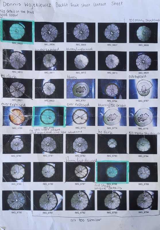
Artist Investigation / Dennis Wojtkiewicz

|
Email Quote – Direct Artist Response |

|
The final artist in the abstract nature project is Dennis Wojtkiewicz. This artist differs from my other artists because all of his final work are paintings. He takes the photos and uses them for inspiration for his paintings. However there are similarities in his use of abstract work and natural forms.
Dennis Wojtkiewicz was born in Illinois in 1956 and is most famously known for his paintings of fruit and flowers. His website is: www.wojtkiewiczart.com The quote is from a direct email response from Dennis. W himself. From the email, I was able understand what equipment & techniques he uses such as a Canon EOS 90D with a Canon EF 100mm f/2.8 Macro USM fixed lens. This video is inspirational to me because it shows you lots of his work that he has done. In the video you can see all the details on the fruits. I really like how he uses back lighting to emphasise the colours and make the images look brighter. |


|
|
Shoot Plan / Shoot Plan Diagram
|
For my Backlighting fruit shoot I got a torch and placed it below a piece of glass that I got from a photo frame. I placed my piece of fruit on top of the glass so you could see the light coming through the fruit. For my camera I used a Canon 4000D and had a slow shutter speed and had my aperture set to f/9 and my ISO set to 100-200. For my lens I used a standard kit lens but you can also use a macro lens, extension ring or a lens ball.
|

|
Photographic techniques / Backlighting fruit
YouTube link for back lighting tutorial: www.youtube.com/watch?v=zErEjr07H8Y
Backlighting in photography is when you position a light source behind the object you are taking the picture of.
To create back lit fruit you will need to choose a fruit that is translucent so the light can pass through. You will need a glass surface to place the fruit on. For lighting you can use a box light to place underneath the glass or you can just use any household lamp. It is best to use a tripod to avoid any camera movement or blur in the picture. You can also use a shutter release cable so you avoid all chances of causing the camera to shake. It is recommended to use a macro lens to capture all the details of your fruit.


Post Editing / Dennis Wojtkiewicz

Editing step 1: In this clip I adjusted the saturation, brightness, contrast, and enhanced the colours so they were brighter. This helped capture the small details within the fruit such as the seeds and the texture of the fruit.
|

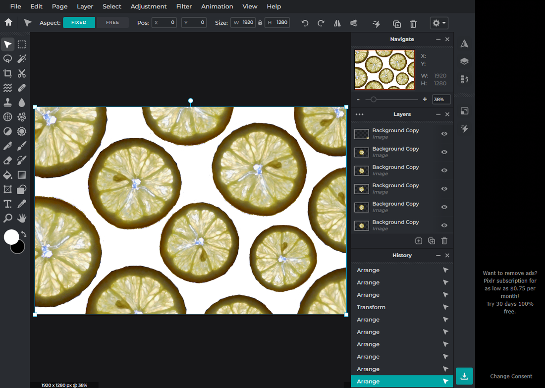
Editing step 2: In this clip I used the lasso tool to cut around the fruit and then inverted it so it would change the background and not the fruit itself, I then added a new layer and used the fill tool to make the background fully white. I then used the lasso tool again to remove any unwanted parts of the fruit that I didn't want in the picture.
|
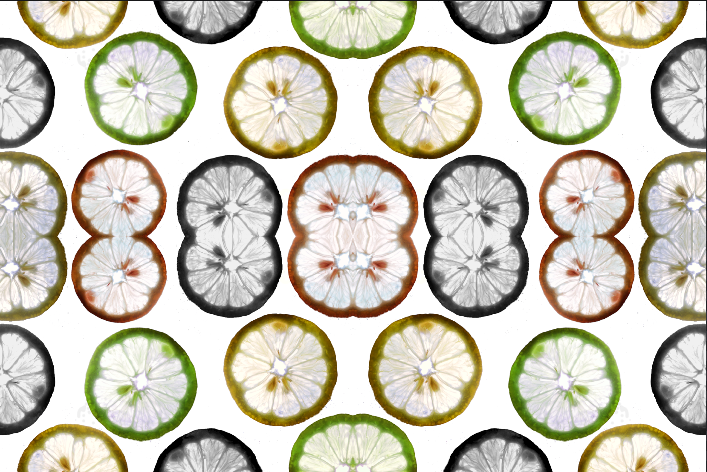
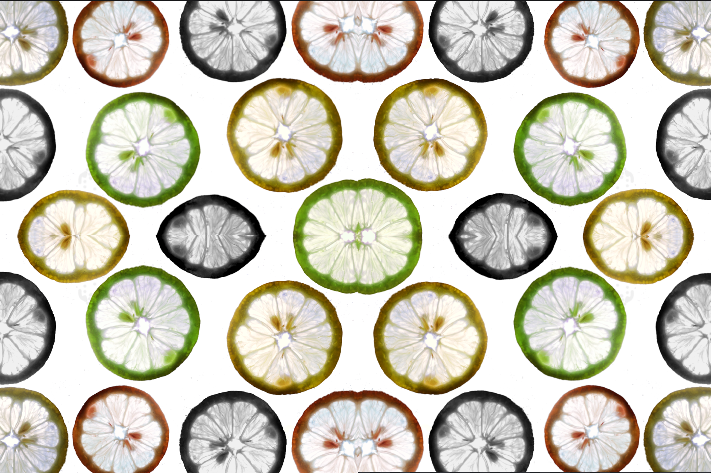
Editing step 3: Using PIXLR I used the duplicate tool to duplicate the fruit. I then rotated some of the fruits around so they would look different and flipped some of them round as well. I also changed the size of some of them.
|

Editing step 4: Finally I selected some of the fruits and adjusted the hues and saturations which made some fruits a lot brighter, some fruits different colours and some of them black and white. This makes the image look more interesting than all the fruits looking the same and being the same colour.
|
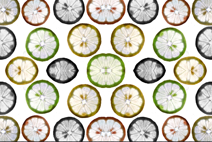
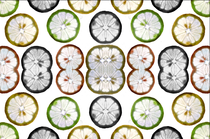
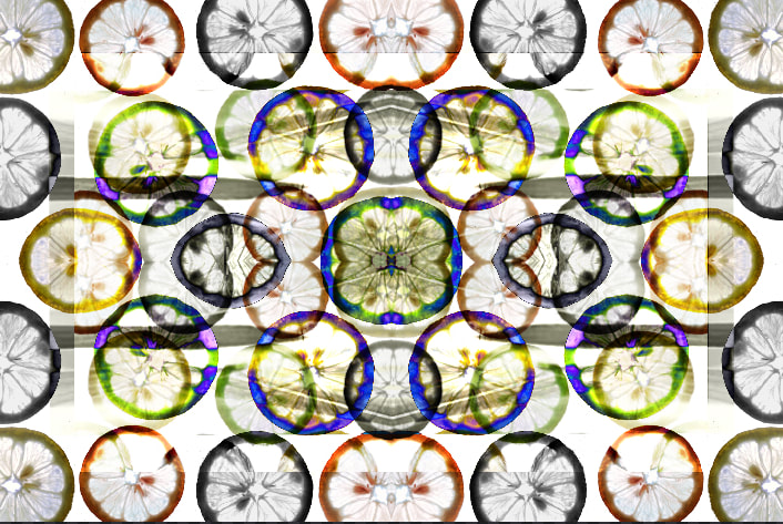
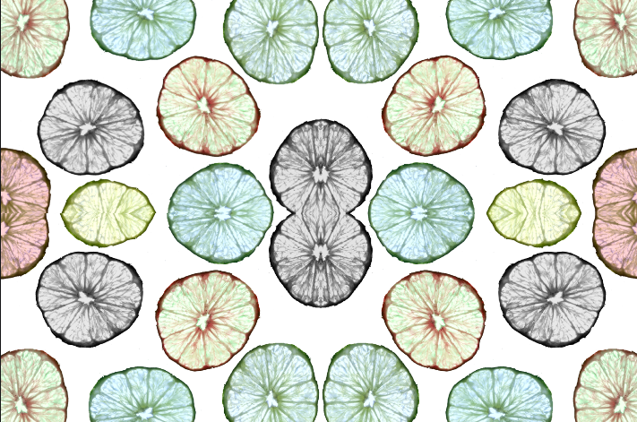
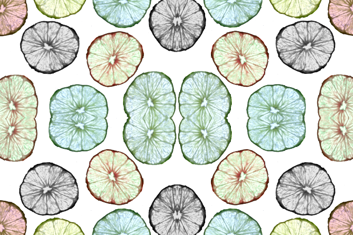
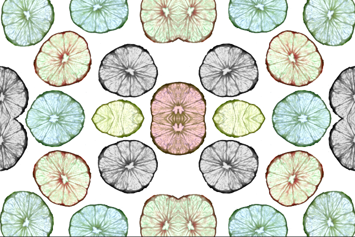
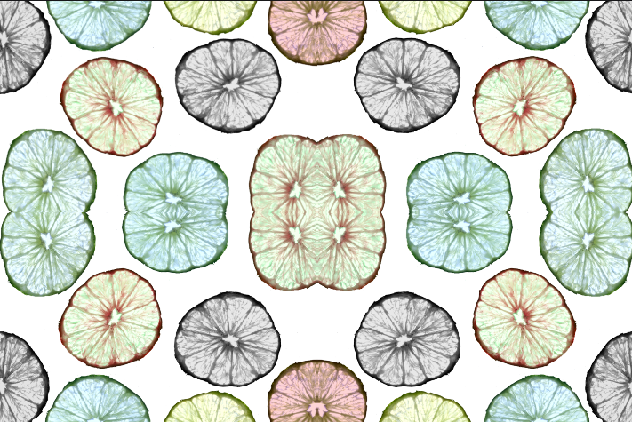
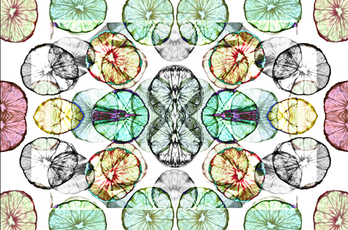
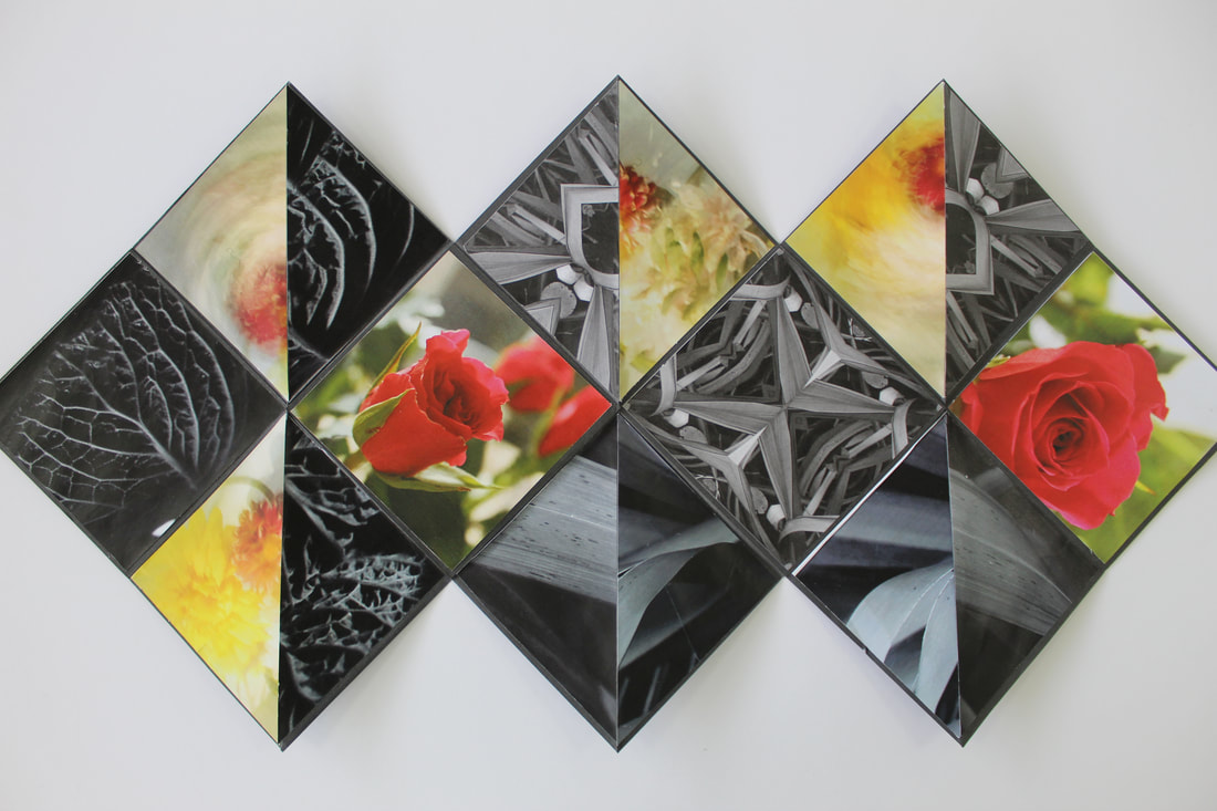
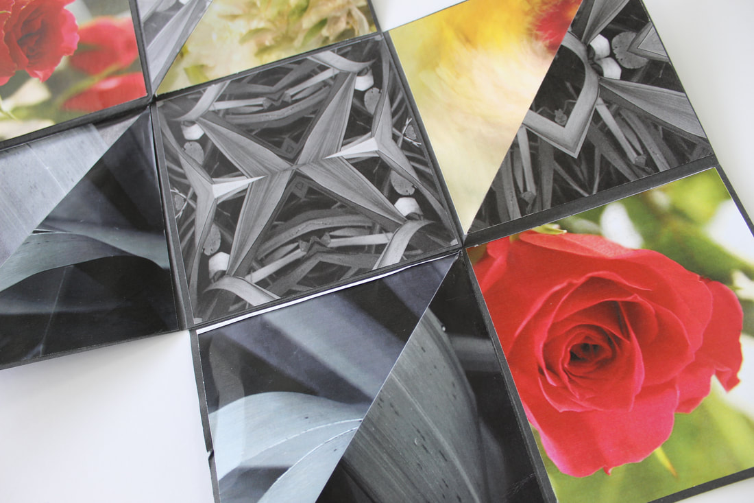
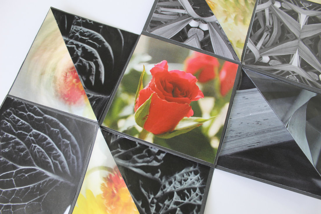
Rotational Designs / Dennis Wojtkiewicz
Using rotational symmetry and the work of Horst. P Horst I have created a series of rotational designs using the elements of shape, colour, form, repetition and harmony. I will develop these further using PIXLR


|
|
|
|


|
|
Abstract Nature Art Evaluation
In this project I developed many important knowledge, skills and understanding about photography. Before I started this exploring this theme, I had little to no knowledge of how to use different camera settings or how to successfully edit an image. Some of the knowledge and skills I have gained during this project include editing images, knowledge of composition, what the different settings on my camera do, different types of photography such as intentional camera movement, high key photography, low key photography and shallow depth of field. I have also developed knowledge of cyanotypes and photograms.
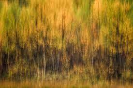
Throughout this theme I have developed my understanding of abstract photography by exploring the theme of nature. During this project I have I have explored many different types of natural forms such as vegetables, plants, shells and fruit. These have helped me understand more about the principles and elements of art and photography. I have explored tone and shape when researching low-key photography, colour and texture when researching back lighting fruit photography, space and contrast when I researched high-key photography, and movement when exploring intentional camera movement. I also explored different techniques that are useful when exploring natural forms and abstract photography, such as monochrome photography which helps emphasise the contrast between tones and textures. Furthermore, I explored intentional camera movement which emphasises the rhythm and colours in the photo instead of the actual object in the image itself.
Initially I researched the work of Edward Weston. Edward Weston's work really inspired me because I think monochromatic photography is very interesting and powerful in the way the tones contrast each other. I was mainly inspired by one of his very famous photographs called 'Pepper No. 30', I really liked how the monochrome emphasised the lines and forms being used in the photo. I enjoyed emulating his work because it gave me a better understanding of monochrome photography and low-key photography. Through studying this artist I was able to explore concepts of line, tone, form and contrast. I then went on to use these concepts when emulating Weston's work. Because Weston shot his pictures in monochrome, there was a wide range of tones in his work which contrasted nicely together, and especially in 'Pepper No. 30' you can clearly see lines and form being used. Because I was inspired by his work, I created numerous emulations by putting a vegetable such as a pepper, cabbage or garlic and placed it inside of a plant pot. I did this shoot indoors during the morning so not too much light would be shining through the windows. I used a piece of black card to remove any unwanted objects from the background. I used natural light that came from a window, but I mainly needed the room to be quite dark to emulate Weston's low-key effect. I used a canon 4000D with a regular kit lens and to avoid any camera movement I used a tripod. I investigated the technical processes, I used a small aperture of f/22 to create that large depth of field that Weston used in his work, along with a fast shutter speed to avoid much light getting in. Weston's work links in nicely with my project because it fits in with the theme of abstract nature. Weston used natural forms in his photos.
After researching Edward Weston, I then moved on to explore the work of Anna Atkins. Her work also inspired me because she worked with cyanotypes which are printed pictures when you use salts and other solutions and put leaves or other objects on a piece of paper and place them under a UV light, you get a image of the object in white whilst the rest of the paper is blue. Through exploring this artist, I was able to learn more about shape and pattern because when the leaves were printed onto to paper, an imprint of the leaf was left. I then used my understanding of these elements and emulated her work and used them in my own photographs. After I explored her work I went on and created a series of emulations by placing small objects such as pine leaves or flowers and placed them on top of a piece of paper that had the cyanotype solution on it, I then placed a clear glass pane over the top and clipped it into place and then placed it underneath a UV light. After around 15-20 minutes, the leaves had been exposed onto the paper so the rest of the paper was blue however where the leaves had been exposed, it was white. Anna Atkins' work linked in to my project of abstract nature because cyanotypes are quite abstract and she used lots of natural forms in her work.
My next artist is quite similar to Anna Atkins. He is called Man Ray and his work inspired me because similarly to cyanotypes, Ray used photograms which are made in a very similar way to cyanotypes. Photograms are very interesting to me because they are not just a regular photo captured with a camera, they are made by using photographic paper and placing an object directly onto the paper and exposing it to light. This way of capturing images is a lot more interesting to me than doing it the usual way with a camera. When I studied Man Ray I was able to explore concepts of shape, pattern and line. His work linked in with this topic because photograms are a very abstract way of capturing photos and Ray mainly used natural forms in his images.
Next, I explored the work of Horst. P Horst. His work was also very inspiring to me because I think rotational imagery is very interesting and is a unique way of presenting images, I think it creates a quite attractive pattern. He was known for being a fashion photographer and designed new patterns. When studying this artist I created a series of emulations by using some of my previous shoots such as my Edwards Weston and Anna Atkins emulations and using an editing software called Pixlr, I duplicated and rotated my images to create a new image. I think most of these emulations came out very well. His work is quite abstract so it links in with my project.
For my next artist I researched a photographer named Karl Blossfeldt. Blossfeldt's work also really inspired me because I really like high-key photography because it looks very neat and bright. Through studying his work I was able to explore concepts of line, pattern and tone and used them in my own photography examples. Because I was inspired by his work I created a series of emulations by getting a flower or shell and placing it against a white background to make the image look brighter. There was 3 different shoots I did for this artist, 1 against a transparent screen with a light behind it and in front of the object, 1 where the object was placed on a tripod and placed in front of a large white screen with 2 large white studio lights pointing at it to make the image as bright as possible, and the final shoot was on the floor and I placed the objects against a white A3 sheet of paper and used natural lights and general lights from the bulbs in the ceiling. I think my most successful shoot was the one one the floor because it felt like I had more freedom to do what I wanted. I investigated the technical processes of using the sepia setting on my camera to create an aged sort of tone to the photo. I took the pictures on a cannon 4000D with an 18-55mm lens and I used a slow shutter speed to let more light in.
The final artist that I researched was Dennis Wojtkiewicz. Dennis was very inspiring to me because he is quite different from the other photographers I have researched because all of his final pictures are actually paintings. He takes photos of fruits and then uses his photos and paints them, so that's why they look so detailed. When I researched him I explored the concepts of colour, texture, pattern and line and used them in my own examples. Because I was so inspired I created a series of emulations which I then edited on an editing software called Pixlr and used it for my final exam piece. When emulating his work I cut a thin piece of fruit and placed it on top of a glass pane, I then placed a light source underneath the glass so the light shines through and the details on the fruit are clear to see. Some of my images came out better than others because some of them were blurry so you couldn't see the details of the fruit.
I think my most successful outcome of this project was either my Dennis Wojtkiewicz shoot or my Karl Blossfeldt shoot. In my Karl Blossfeldt shoot there was a successful use of the rule of thirds and space because the object in the photos were very centred. I also think the lighting was perfect because it wasn't too dark but also not too bright and the different tones in the image contrasted nicely together. On that shoot I shot my images from a birds eye view which meant you could see more of the image which was what I was trying to accomplish because high key photography is meant to be bright and where you can see everything. My Dennis Wojtkiewicz shoot was also successful because by the end of this topic I had more knowledge on editing and my camera settings so my images came out better than the images from previous shoots at the beginning of the project. I think the lighting was successful because it showed all the smaller details of the fruit. I enjoyed these 2 shoots a lot because they taught me new skills such as using the sepia setting, and they expanded my knowledge of editing such as overlays, layering and collaging.
I think my areas for improvement are to annotate my research in more detail and use more technical words/key terms. I also think I need to improve some of my artist research and add more detail to them. I also think I need to learn how to get to all the different camera settings because sometimes when I am trying to change the settings on my camera I get confused and forget how to change them and what buttons to press. I need to improve on my knowledge on technical processes such as shutter speed, ISO, and aperture settings because I'm still not completely confident with how to use them and exactly what they do.
